
♦Welcome to another edition of the Open Book Blog Hop!♦
Topic #446
Do you favor certain color schemes for your book covers?
Welcome back to another Open Book Blog Hop! The authors included in this ongoing series wish to thank you for your reads. Even more so, we appreciate that you share our writings with friends. If you’re new to the series, welcome aboard. The authors engage and impress weekly. Prepare to become a regular reader.
Favorite colors and favorite songs often change with time. Not everyone starts out a blues fan. Some folks, however, do stay with a theme during their life. When I was younger, the reds caught my eye the most. The redder my hair got, the less I could pull off wearing those tones. It was a bit much! Yet, I remember, really loving the color of my brother’s bedroom rug: bright blue. I was kind of jealous, to be honest.
To start, let’s take a look at my covers and see if we can spot the commonality…


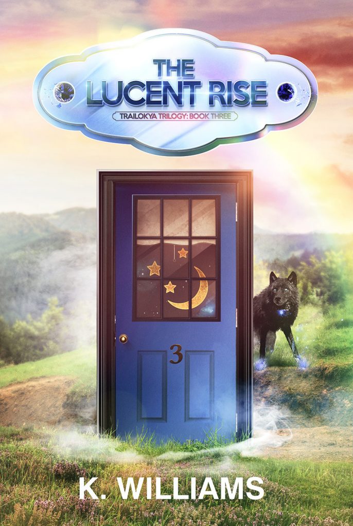

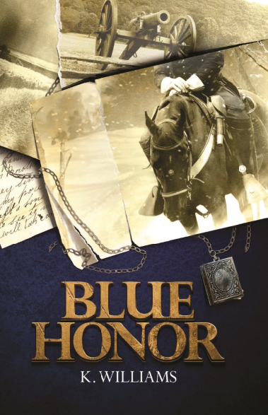
My current spread of book covers.
As you can see, the majority of my covers are dark in tone, heavy on the blues. I guess that started with Blue Honor. Even the first cover, which I created alone, is dark blue outside the central horse image and gold lettering. It was very literature library in context. That look is intentional to recall the idea of classic literary drama. In my mind, military fiction and dark fantasy require artwork that reflects the dark content.
Constant themes I may cover are hard choices with unknown results, strife and struggle, war in general. All the nightmarish things. Horror, after all, is best when it is something that haunts you. The villains feared today differ from monsters our ancestors shuddered at. Even my daughter, at her small age, fails to find Pumpkin Head (1988) a horrific thing as originally billed by the GenX film. Most horror in existence fails, likewise, to affect my sleep. Like my kid, only those terrible things that can actually happen create a fear response.
For instance, Michael Myers is still pretty on par for frightening. Think about the rash of mass murders in the US committed by troubled young men. Serial killers are very real things. When it crosses into the realm of he’s not stoppable by a bullet, though, I lose that concern. He becomes no more than a Frankenstein’s monster. I really enjoy the social media videos of Michael of Decatur. It’s a good laugh! In kind, the Hellraiser (1987) films, also, don’t pose much more than a dark comedy.
This tracks into my own work, as I am heavily inspired by the horror genre as well as fantasy. I think my covers have a great deal in common with horror story covers and film posters. The blues reiterate to the would be reader that the story within is dark, likely a thriller, covering tough topics. War and war time is never an easy thing to cover. From the entrenched opinions to the violence, there’s much to cause the reader distress. Imagine writing them, revisiting things you may have experienced and sharing those harrowing feelings. Sure, it makes it more real, accessible, whatever, but it is something with which you really need to choose engagement. Color scheme can help to provide a footnote.

For instance, you’ll notice that my trilogy gets progressively brighter, but it is still ranging in the gloaming by the last book. Unknowns reign. The results may be just the start of further conflict. In addition, some folks may notice the rainbows and read coding that relates to their lives from that. Color schemes may not seem intentional. Just keep in mind that planning that cover takes a conversation with the designer including the synopsis of the story. There’s approvals to be given. The author (and their publisher if one is traditional) will go through a long process of applying the right cover.
It’s no accident to choose the blues. Somber tales do best wrapped in their somber covers, serving as a tell for the would be reader. I can’t imagine the poster for the Exorcist (1973) being successful if it were yellow or baby blue, or even a lovely pink. That black and white night with a single street light certainly does the trick!
It’s my hope that my covers express the theories and ideas contained in the pages in such a way that folks checking out the books are drawn to them for the right reasons. I took off the gloves on my trilogy and held no punches. The others go into details of war realities and society that will make readers shudder. If they’re ready, they’ll flip back those dark blues and start the story.
Just like in film, cover colors serve a purpose. Let’s check out the other authors to see how they feel about their own covers and color schemes. Were they going for whimsy and comfort, or deep intrigue? Click on their links below to see where they’re at on this topic. Don’t forget to subscribe and get this hop delivered to your inbox each week. A new question is answered by our team of authors from the other side of your beloved books. See you next time!

Thinking of the Exorcist advertised in Barbie pink made me giggle. Thank you!
LOL now I’m picturing Regan all dressed up as Barbie.
Yes, dark colours for covers go well with the kind of topics you choose to write about.